Rejuvenating the brand of the world’s No1. Private Label Scotch supplier
Client: Quality Spirits International
Role: Brand identity, UI
Quality Spirits International (QSI) is the world’s No1. Private Label Scotch supplier. From the heart of Scotland, QSI offers a wide range of affordable, quality Scotch whisky brands to retailers and distributors around the world. In addition to Scotch Blends and Single Malts, their portfolio also includes Irish Whiskey, Gin and Bourbon. With over 30 year’s experience, and customers in over 70 countries, a QSI bottle is sold somewhere in the world every 1.3 seconds.

The challenge
Following the Covid Crisis, QSI faced a number of challenges: a saturated market, increased competition from both established and emerging brands, changing consumer preferences, and the need to differentiate their brand.
To address these challenges, we worked with QSI to reposition and redevelop their brand identity to better reflect their company values of Professionalism, Expertise, Independence and Excellence.
Visual identity
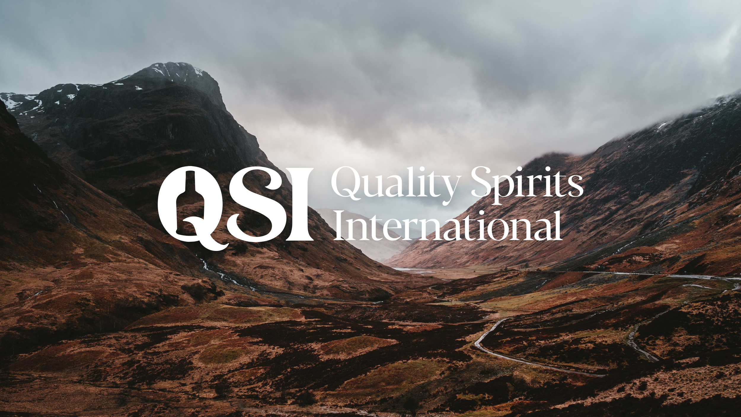
We took inspiration from their most recognisable product, Grangestone Scotch Whisky, utilising the bottle silhouette in the negative space of the ‘Q’ in QSI. Coupled with sophisticated letterforms and a subtle homage to the copper stills used in distillation, the new logo effectively conveys an elevated sense of experience, credibility, and quality.
Shaping the broader visual identity, we built upon the bottle silhouette. We used enlarged and rotated segments of the bottle as a versatile element to partition images and as a holding device for text. Paired with beautiful landscape photography and refreshed bottle images, the new style felt confident, distinct and recognisably QSI.


Website approach
For the website, we established three core goals:
Develop a site that motivates customers to inquire about QSI’s products.
Showcase QSI’s bottle portfolio through striking imagery and design.
Utilise clear and concise language to guide B2B decision-makers efficiently.
While auditing QSI’s previous website, we identified a need to consolidate numerous ‘microsites’ representing QSI’s varied brands. To enhance user experience, we integrated these under a single umbrella. This strategic move simplified customer interactions by allowing them to browse multiple brands effortlessly within the same site.
