Aizle
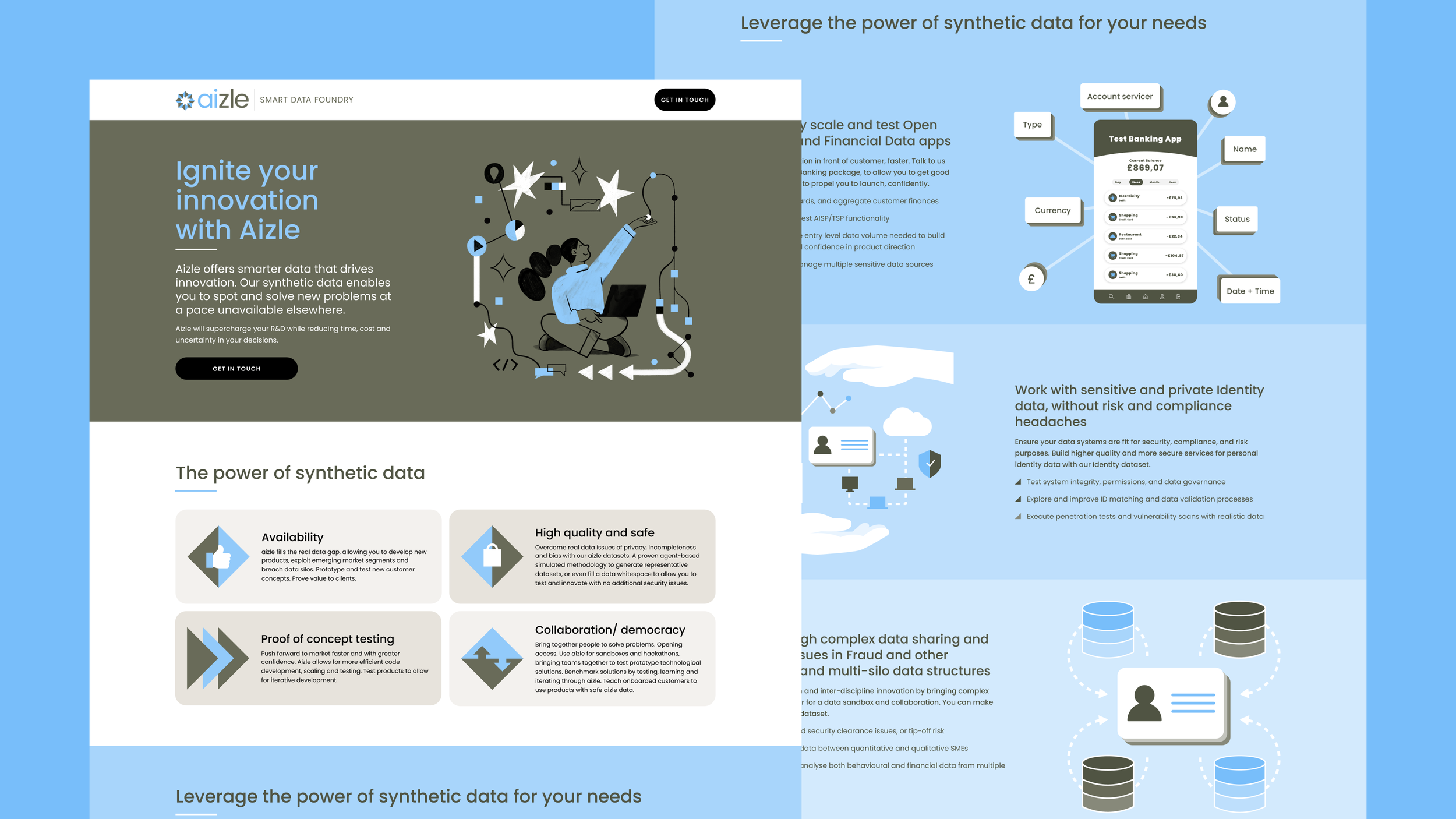
Spun out of Smart Data Foundry (SDF), Aizle is a revolutionary synthetic data platform; generating trusted agent-based synthetic data that requires no real data to seed the data generation process. They required the creation of a sub-brand and microsite.
Playbook
Founded in the Netherlands, Playbook transforms the way organisations cultivate team culture and growth through a customisable online platform. ‘Playbooks’ are modular meeting or training sessions designed to inspire and engage teams, transforming the workplace into a vibrant community of motivated individuals united by common goals.
I am the lead designer for the brand and entire platform.

LEWIS Charades
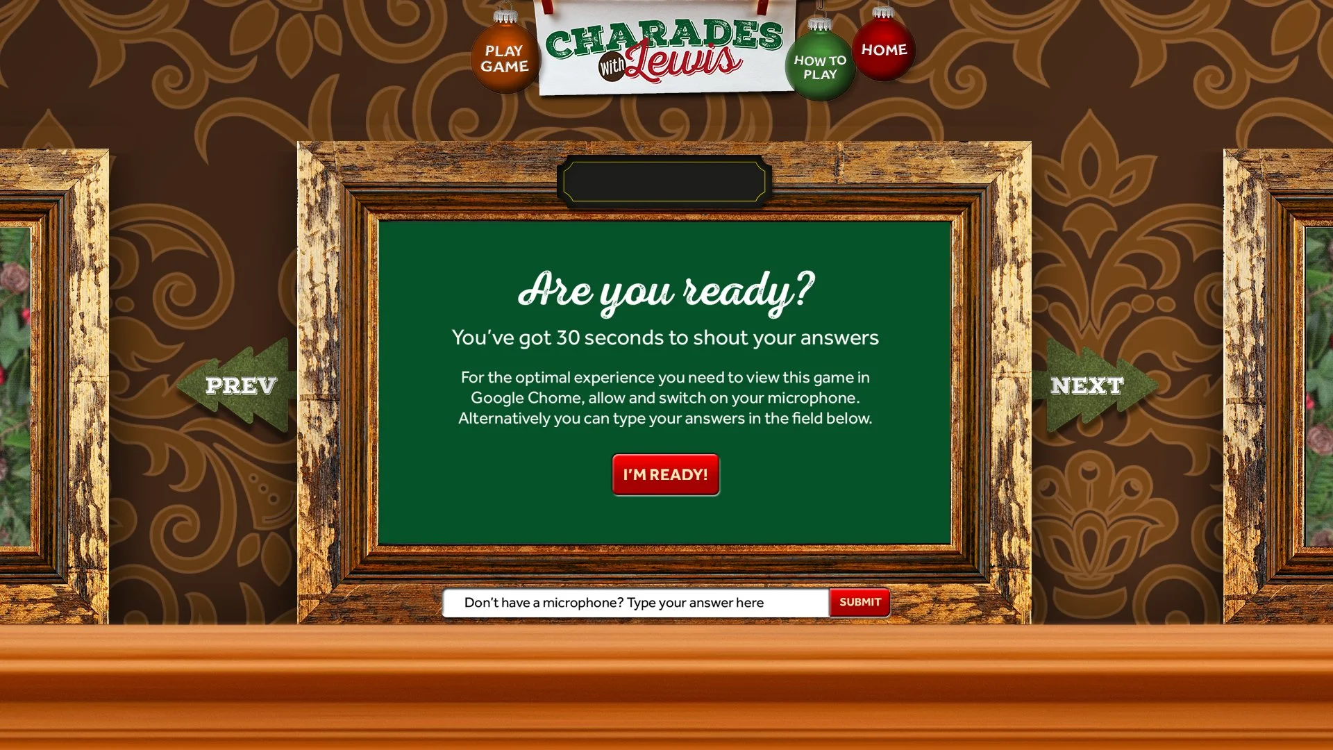
Charades is a common game played during the holidays, especially with your family at Christmas time. We recreated that friendly, fun and competitive game with a festive twist, harnessing the technology behind Google’s web speech API.
Due to workloads and budget constraints we couldn’t play the game live with our audience so we pre-recorded a selection of charades, acted out by myself and the lovely staff at LEWIS.
All players needed was Chrome and a microphone (if they didn’t they could type in their answers). They could then work their way through the rounds guessing charades by simply shouting answers at their computer. Once they either guessed a correct/incorrect word or the entire title, the game would automatically respond with the actors responding to a guess and the console filling in parts of the phrase until they completed it.
Click to on arrows to scroll through images


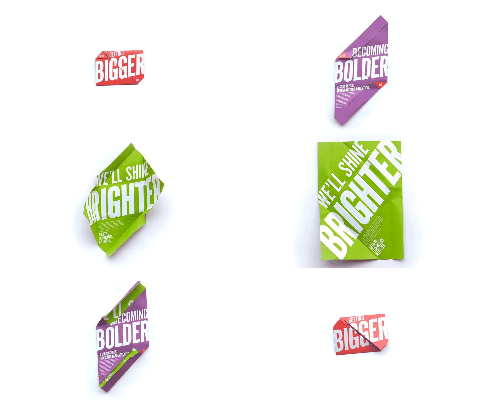
A bigger, bolder, brighter office move
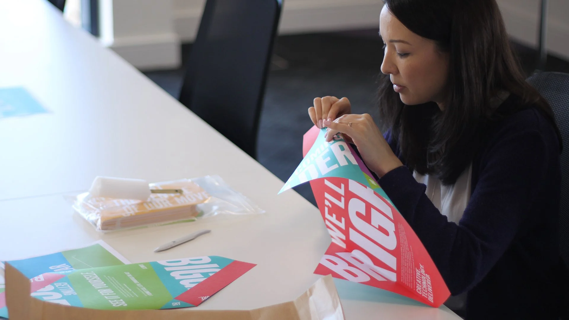
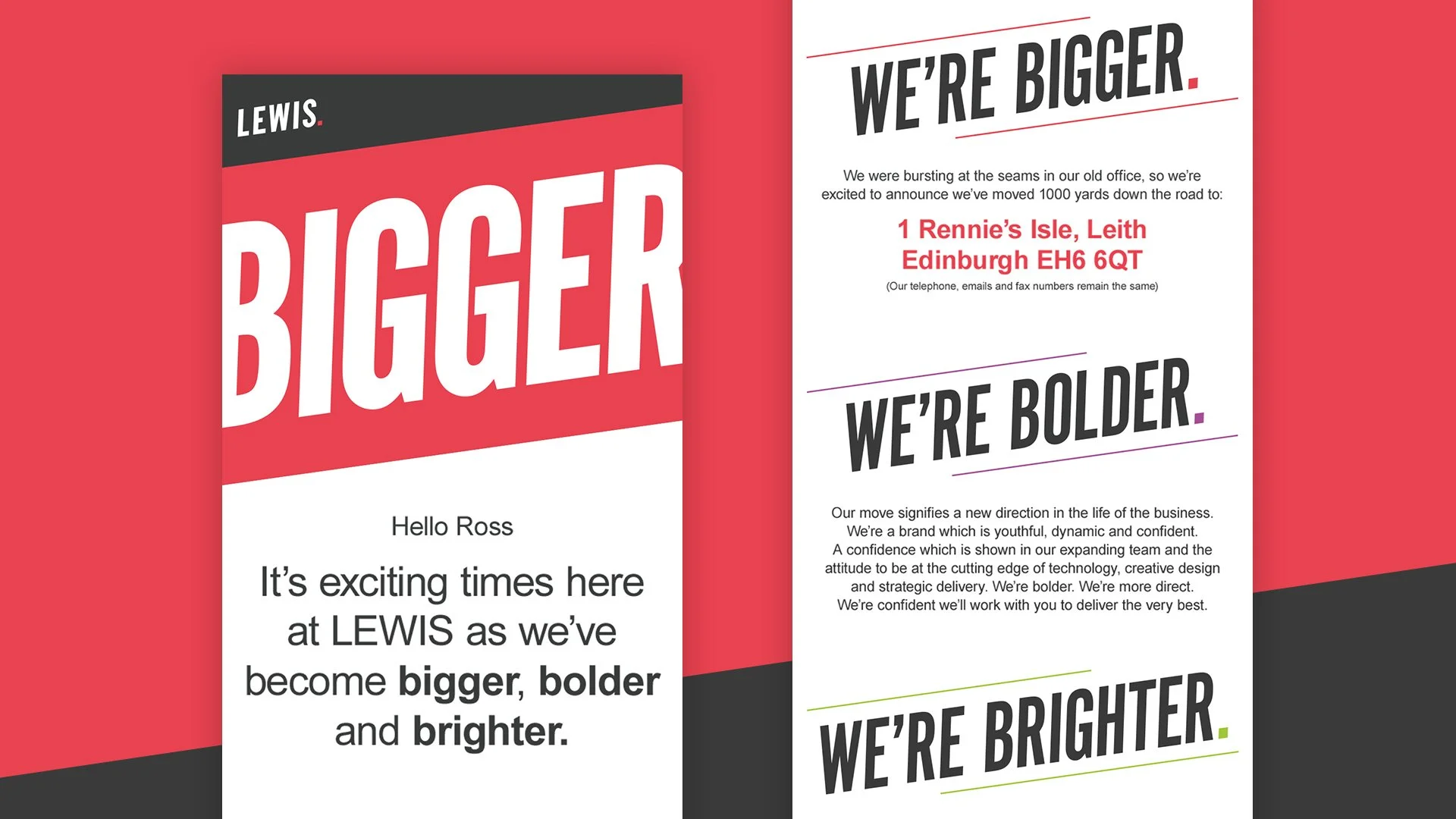
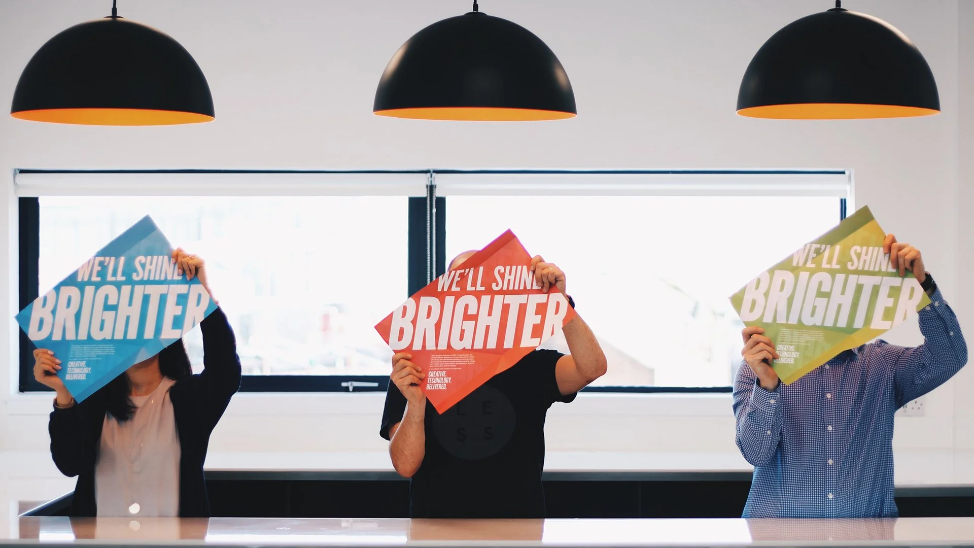
When LEWIS expanded and moved to a larger office I designed a direct mail piece and email templates, not only to inform clients of our new address, but also to introduce the refreshed LEWIS rebrand. The concept poked fun at the fact that we were ‘bursting at the seams’ in our little office - so the oversized typography reflected just that.
All 400 hundred mailers were hand folded by yours truly.
Click to on arrows to scroll through images
Kames Capital Leading Light
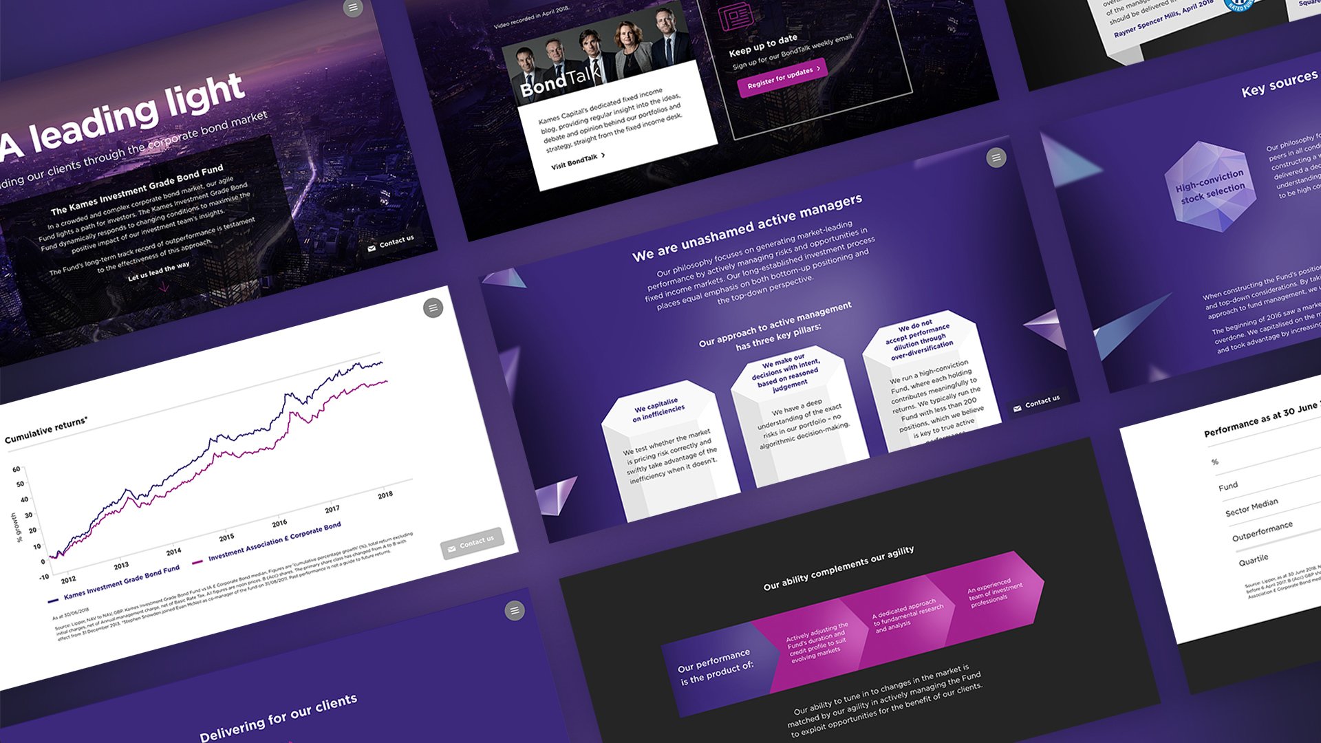
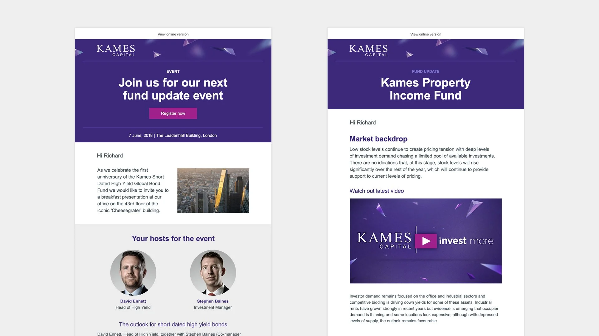
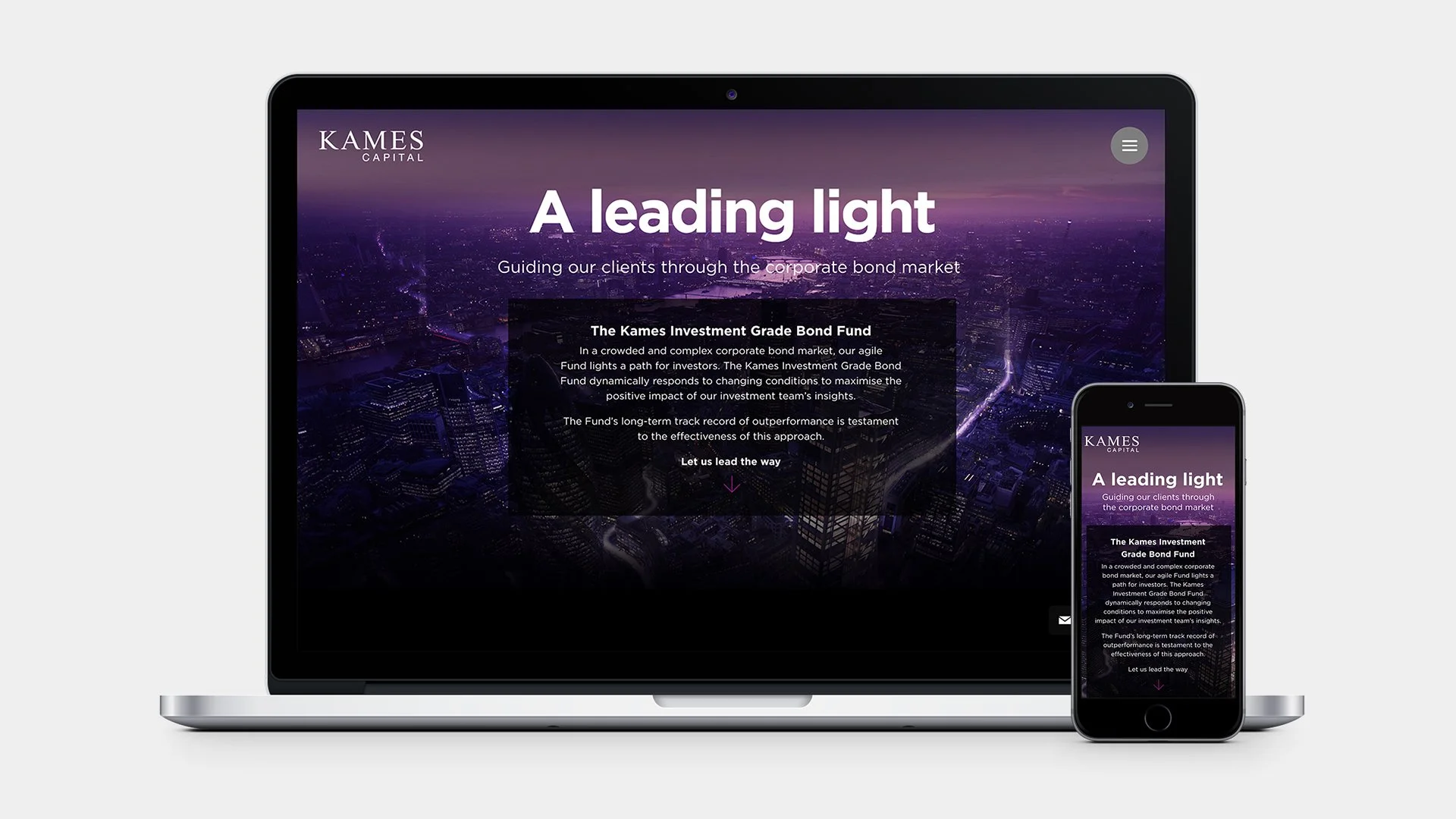
Kames, a UK-based investment management business, asked us to help them create a microsite to promote their Investment Grade Bond Fund for the UK and Global markets. We also work with them to design, build and manage their email marketing.
Given the scope of the requirements we thought it would be a great opportunity to use Readymag to build the site. The result is a simple one page scrolling site with slick transitions, utilising custom code to pull in videos and Google charts - all to show prospective clients how well the fund is performing.
Click to on arrows to scroll through images
Santander for Intermediaries
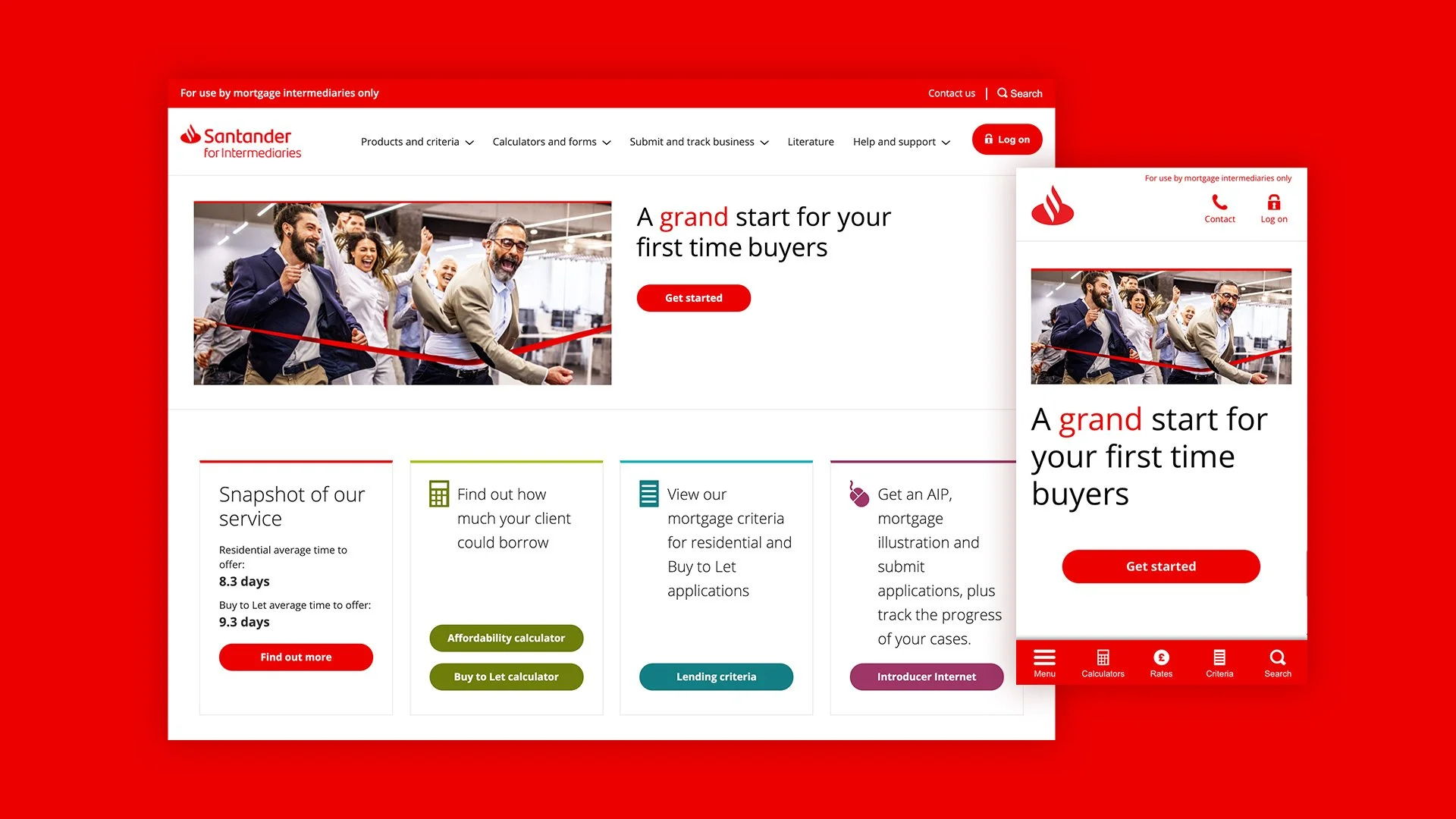
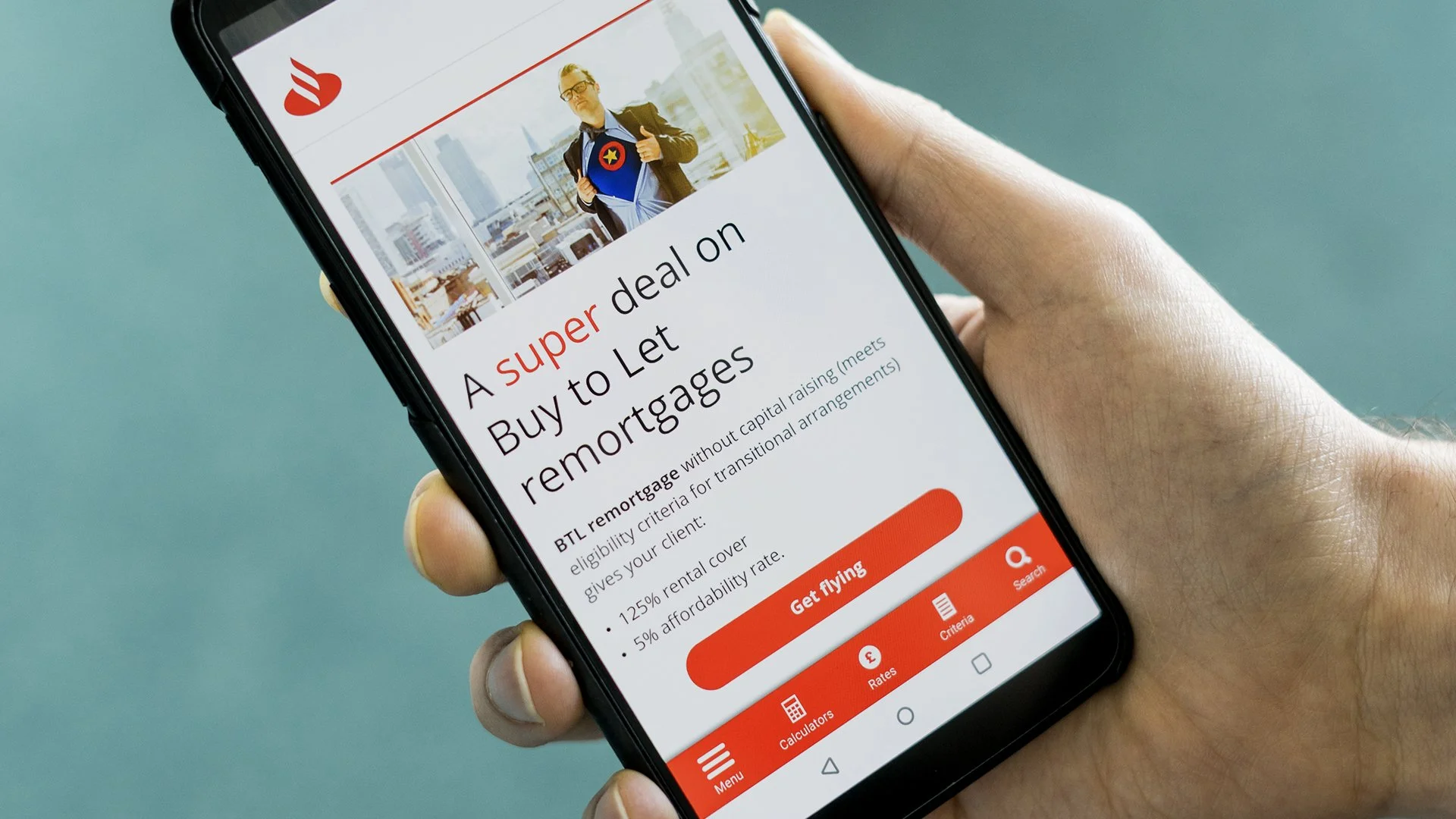
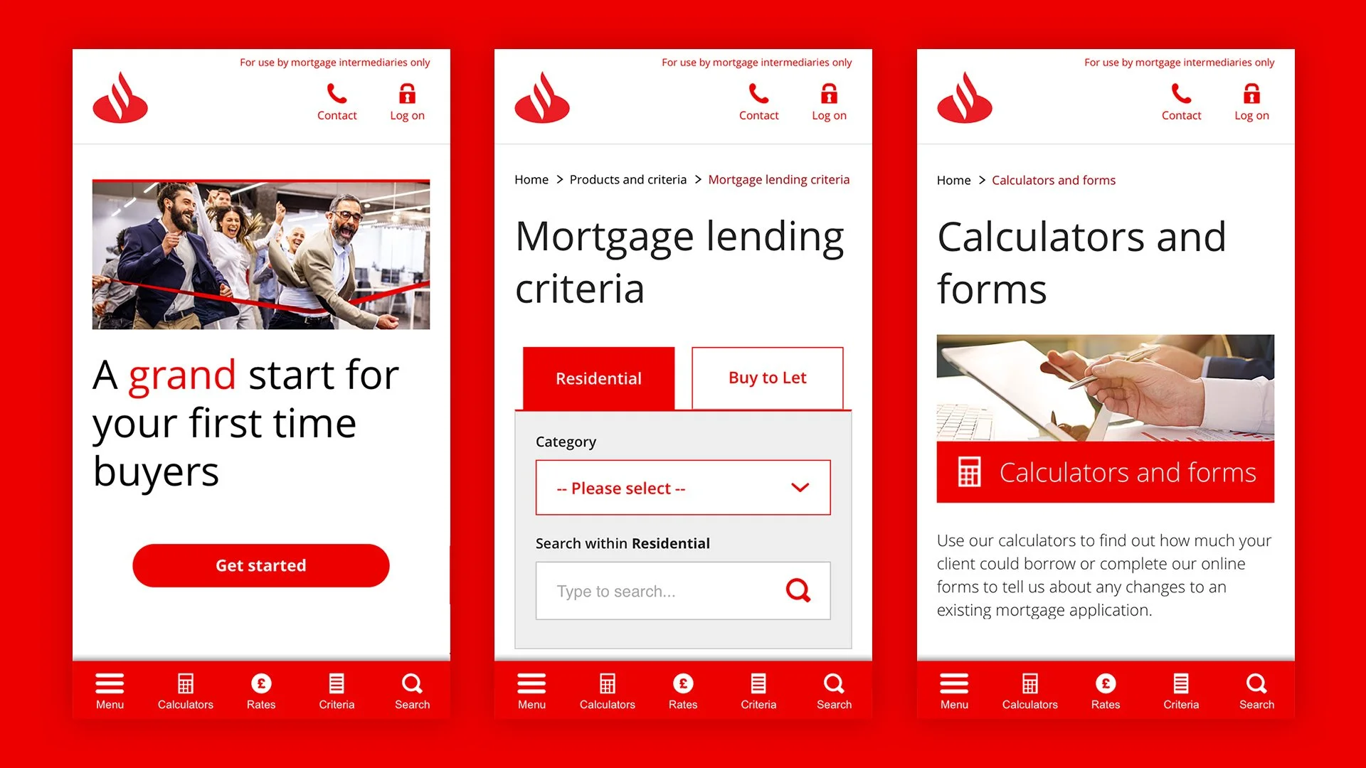
Using analytics, testing, and feedback, we implemented design improvements to enhance functionality and the overall customer experience. We focused on making key features more prominent, removing unused elements, and reducing the number of clicks needed to access deeper content. Recognising that many users browse on mobile with their thumb, we moved the primary navigation to the bottom of the screen for easier access and simplified tables and downloads to better support key user journeys. These changes resulted in a 10% increase in repeat visits, a 30-second reduction in the time users spend finding information, and fewer pages visited on average.
Click to on arrows to scroll through images
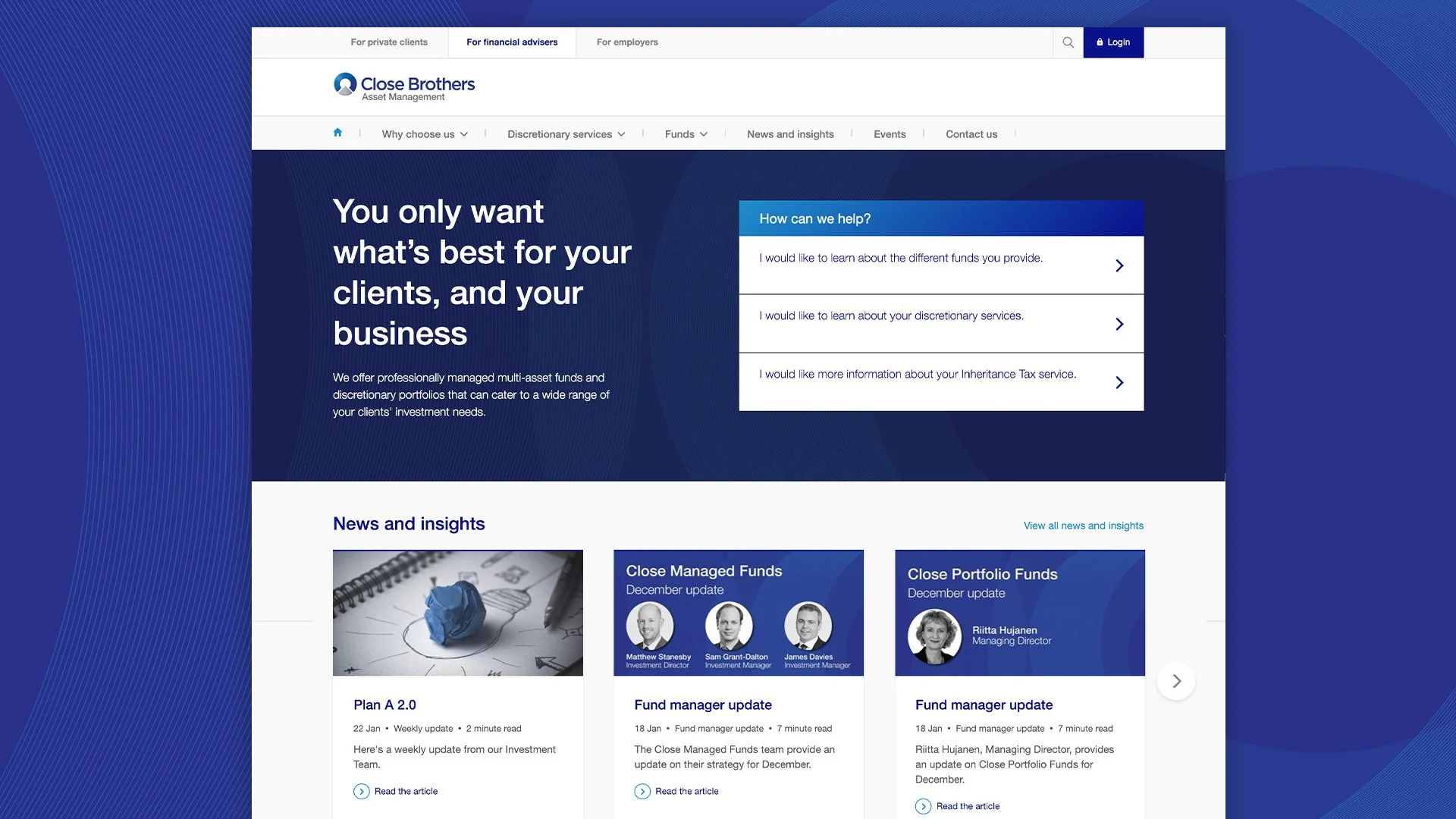
Close Brothers Asset Management
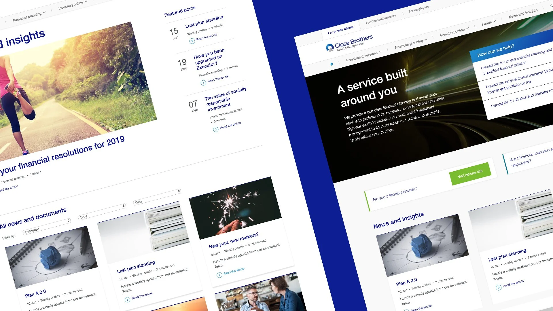
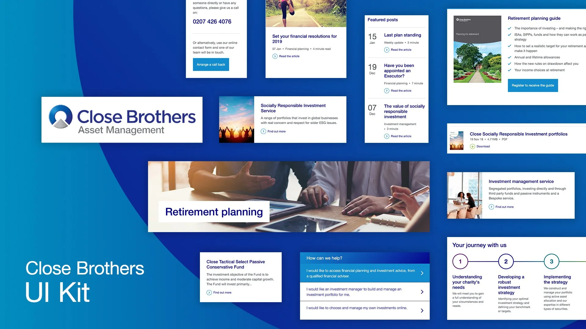
Close Brothers Asset Management (CBAM) provide financial planning, investment services and investment management to professionals ranging from high-net-worth individuals to financial advisers.
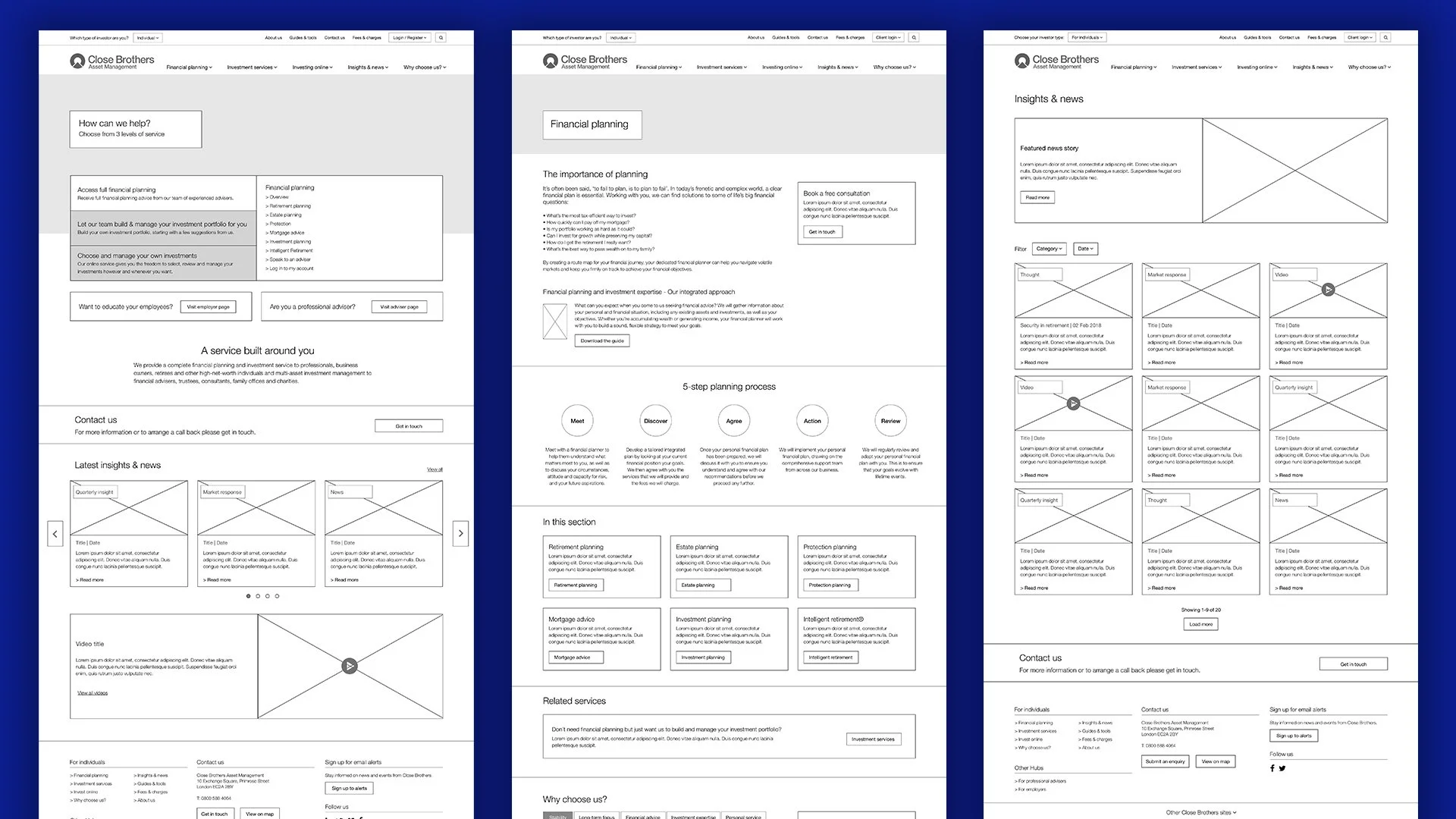
It had a been a while since the original site was built which meant they didn’t have enough flexibility to create pages they needed as the business evolved. They were very keen to have a new site with a much more user-centric focus to help clients get the information they needed, and get in touch with the right people the first time.
A key challenge was to be able to speak to their multiple audiences in a clear and effective way without diluting the user experience for each of those audiences. We devised a solution using audience tabs above the primary navigation and implementing a prominent service selector tool on the homepage.
While we had seen an increase in the number of visits to the website and the number of repeat visits (up 10%), the most significant results were a reduction in time visitors spent finding the right information or to process applications.
Click to on arrows to scroll through images
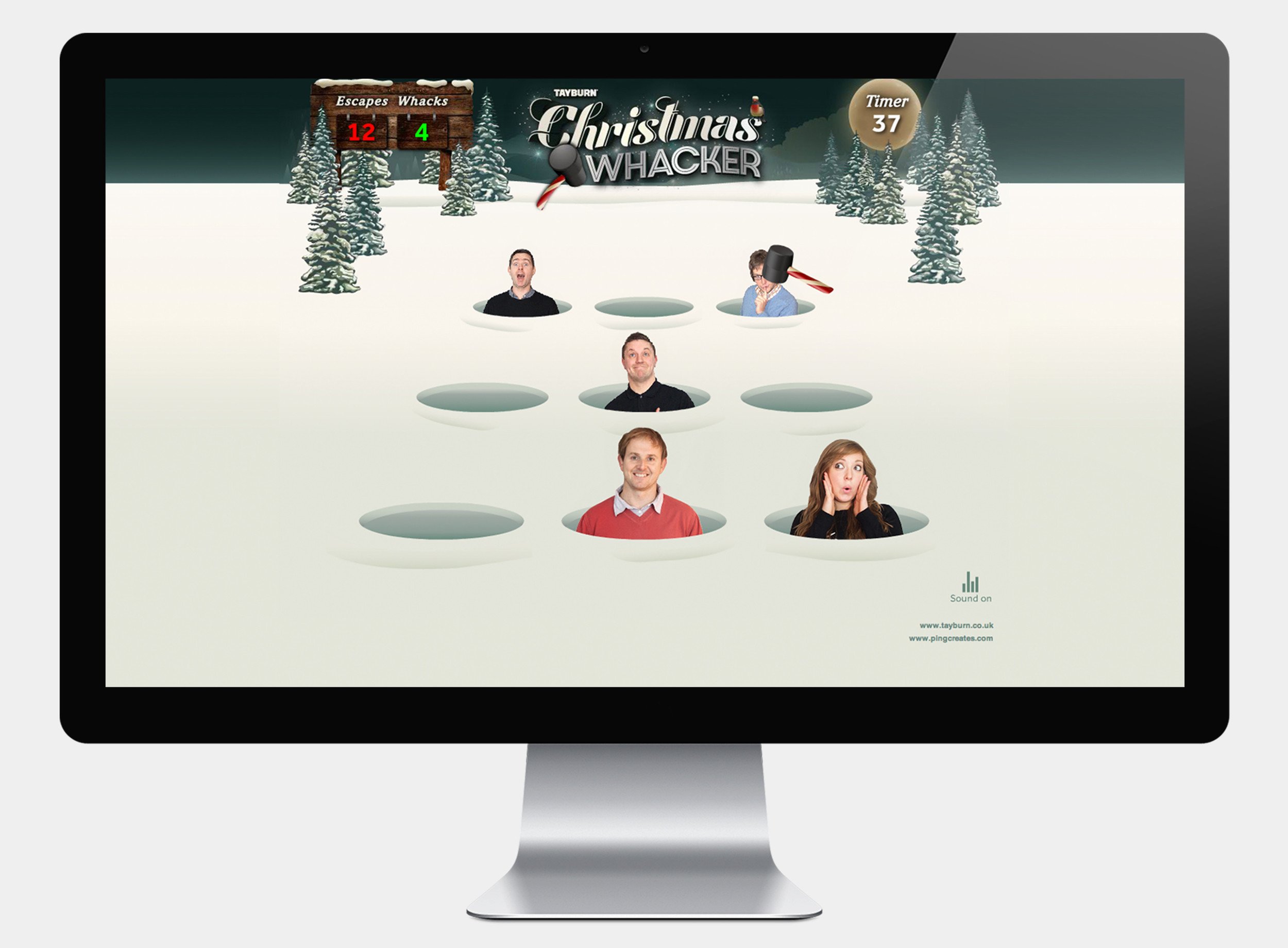
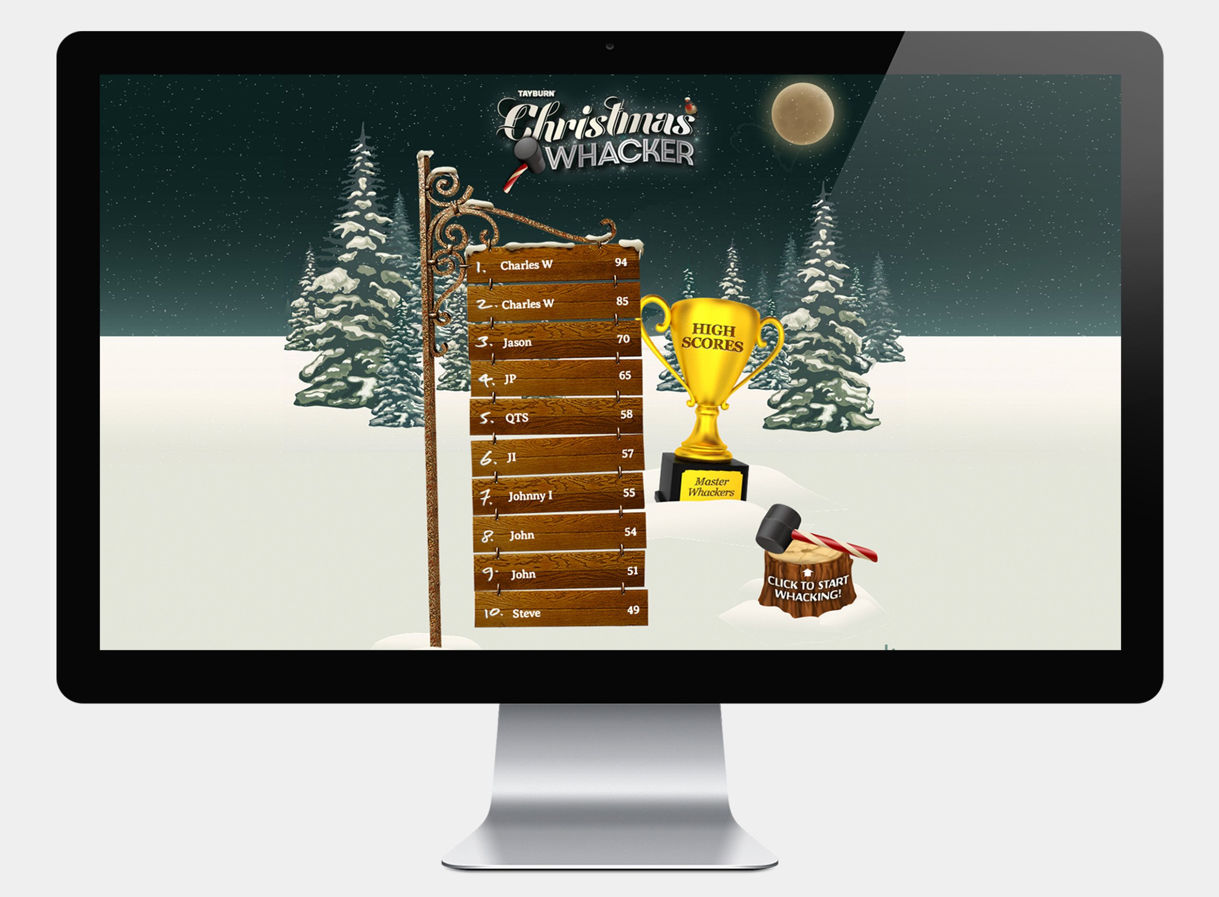
Tayburn Christmas Whacker
Another agency Christmas campaign. Tayburn Christmas Whacker was inspired by those whack-a-mole games we used to play as kids in the arcade. Instead of ‘mole’s I photographed Tayburn staff so our clients could have a little fun trying to whack as many as they could before the timer ran out.
Feedback from clients was positive and one even said their entire department had the most unproductive morning when they received it! Another client loved it so much they asked if we could repurpose it for their own campaign.
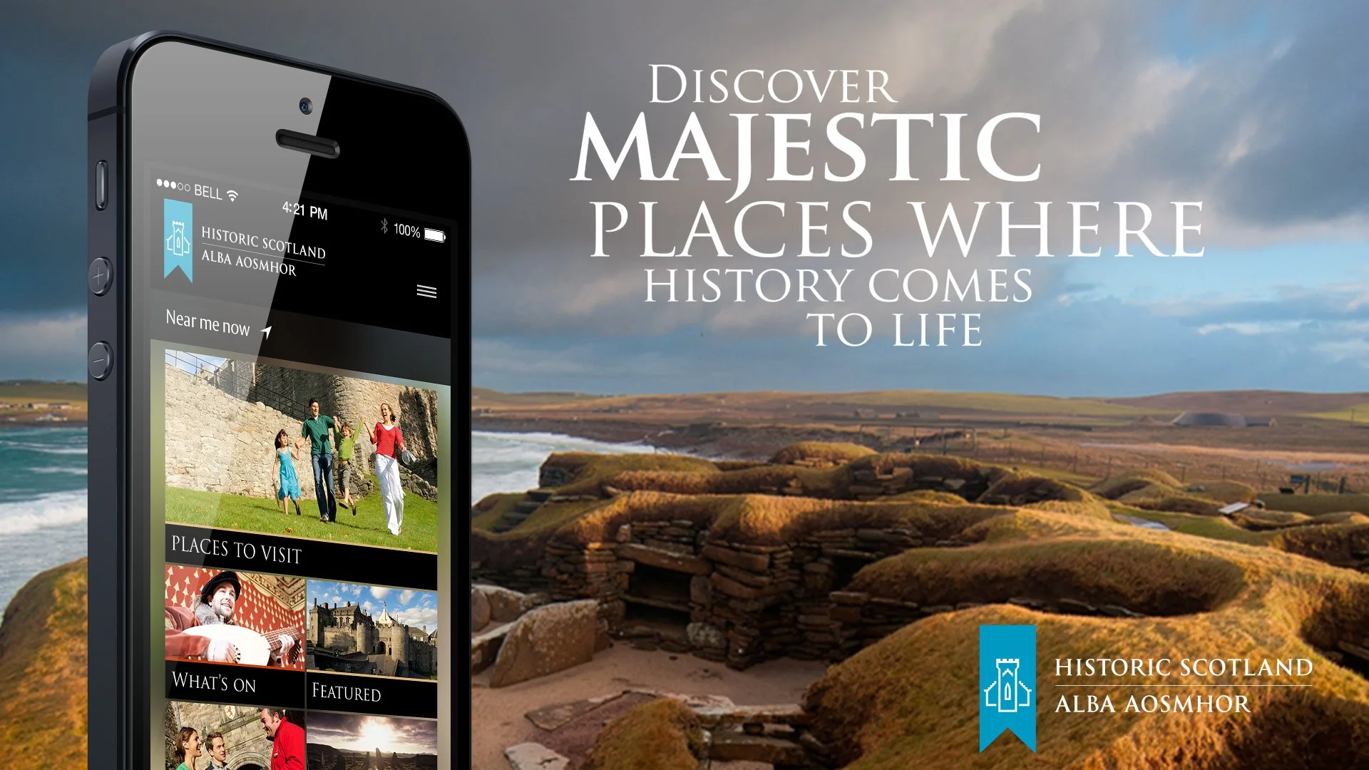
Historic Scotland - App guide for visitors to Scotland
Historic Scotland maintains more than 300 iconic properties of national importance - including Edinburgh Castle, neolithic Skara Brae in Orkney and Fort George, near Inverness.
With so many locations, they needed a mobile app which could help visitors to Scotland identify, plan for and explore their historic sites. The main aim was to replace printed guides and offer additional information and services at each location.
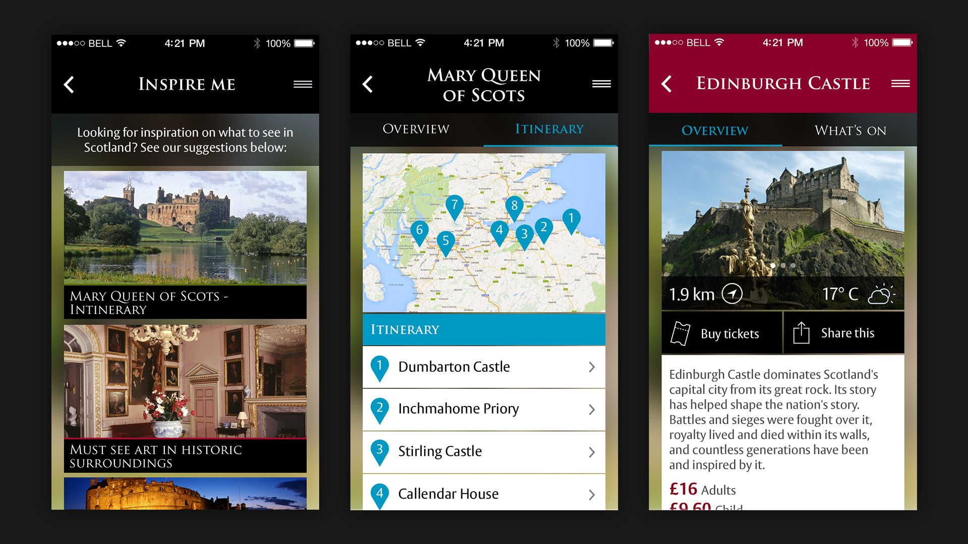
Working with their brand guidelines we created a design which allowed users to view key attraction details and implemented searchable categories that provided results based on location, type of attraction and the price.
The ‘Near Me’ tool identifies all Historic Scotland attractions close to the user through their location settings – a growing trend in app development. The ‘Inspire Me’ screen includes featured content, seasonal events and pre-planned itineraries to boost footfall.
Click to on arrows to scroll through images
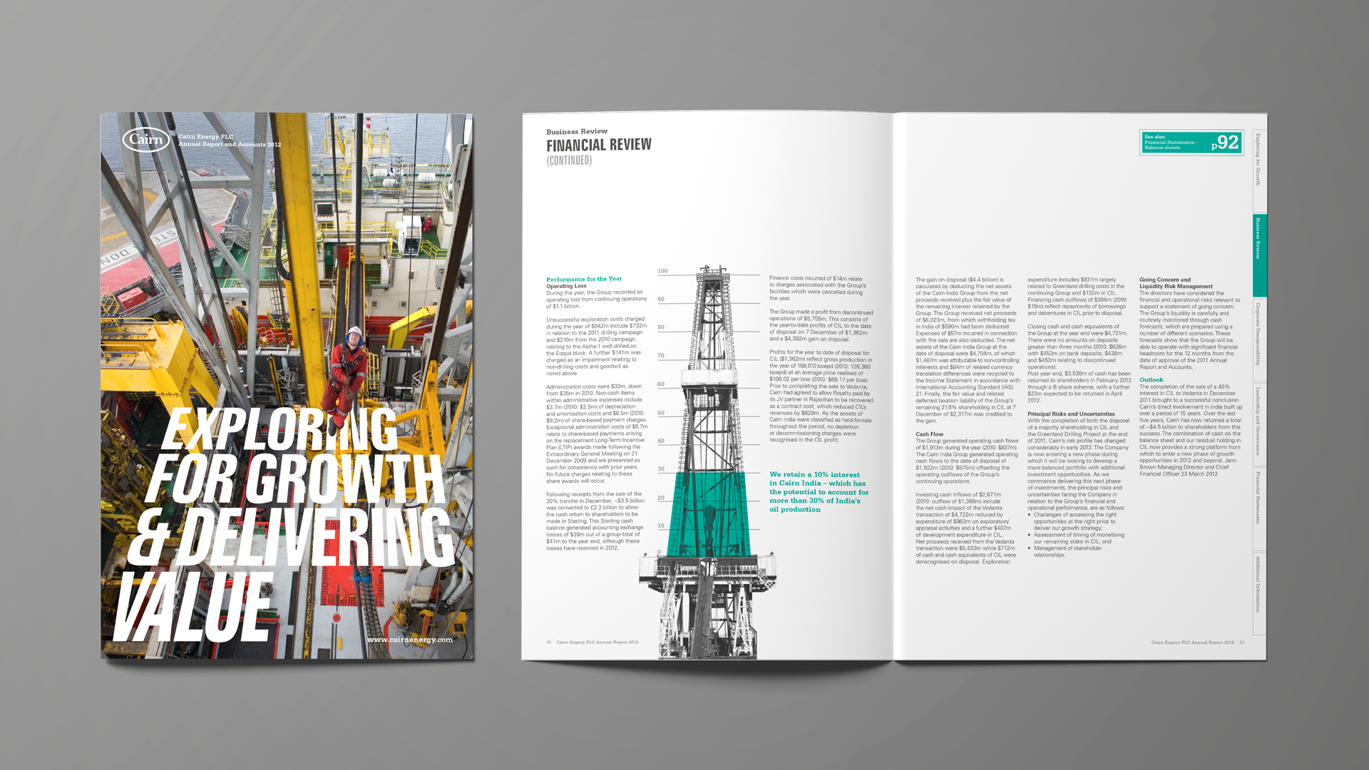
Cairn Energy
A pitch for their annual report. Didn’t make the cut but I really liked the designs!
